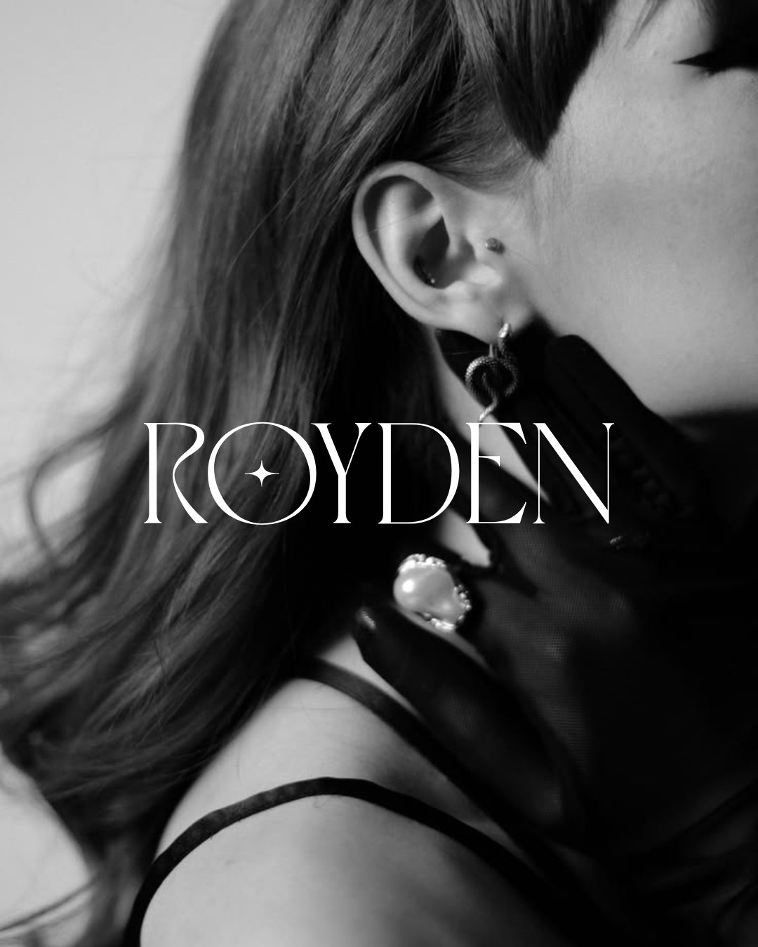
Royden
#rebranding #jewelrybranding #branddevelopment #businessdevemlopment #concept #luxurybranding #celestialminimalism
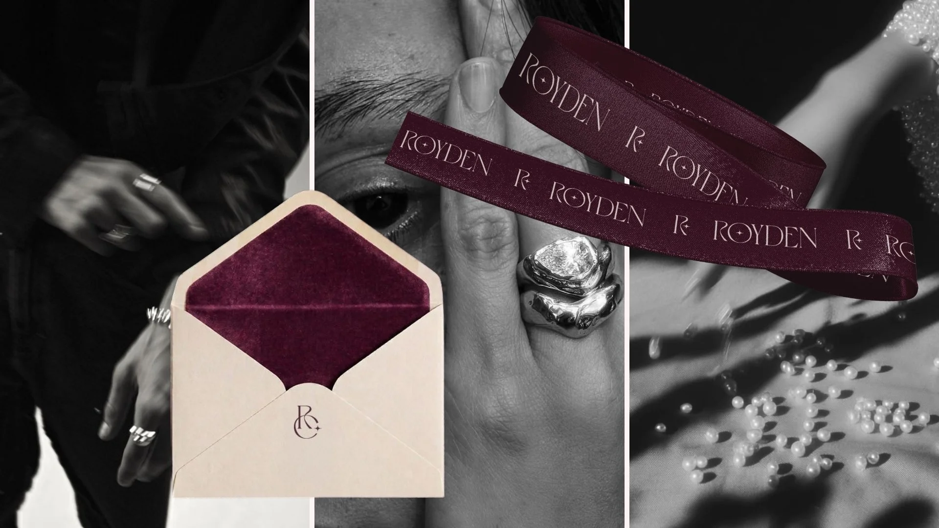
Royden, a contemporary fine jewelry brand, embodies a fresh yet timeless approach to modern craftsmanship. Our role at Brandigo was to craft a complete visual transformation from a refined typographic identity to a highly tactile branding ecosystem that extends into every physical interaction.
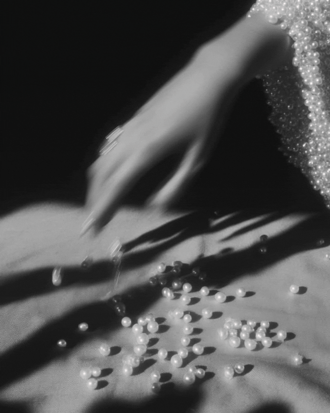
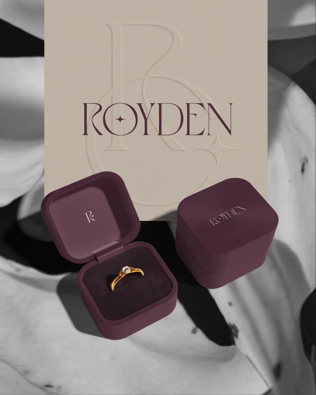
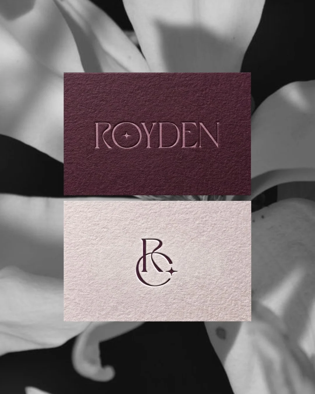
Each design element was developed to feel both contemporary and deeply rooted in artisanal elegance. Moving away from conventional jewelry codes, we explored the concept of “Celestial Minimalism.” The core identity features a custom serif typeface paired with a delicate starlit icon nestled within the typography acting as a symbolic bridge between the vast calmness of the night sky and the intimate warmth of fine jewelry.
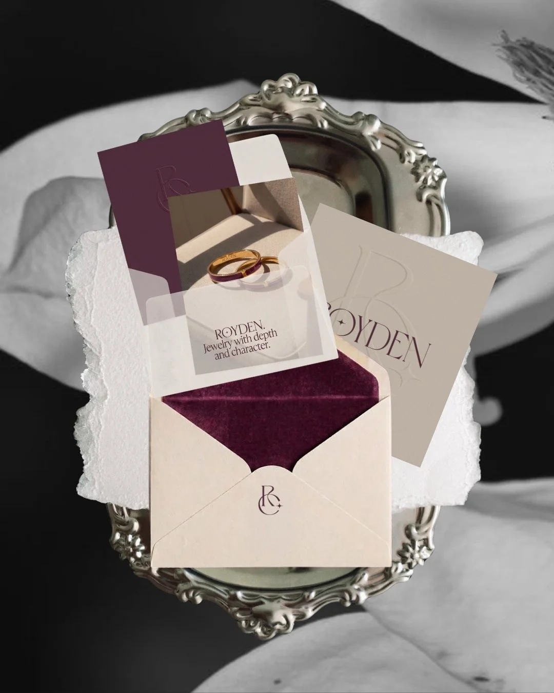
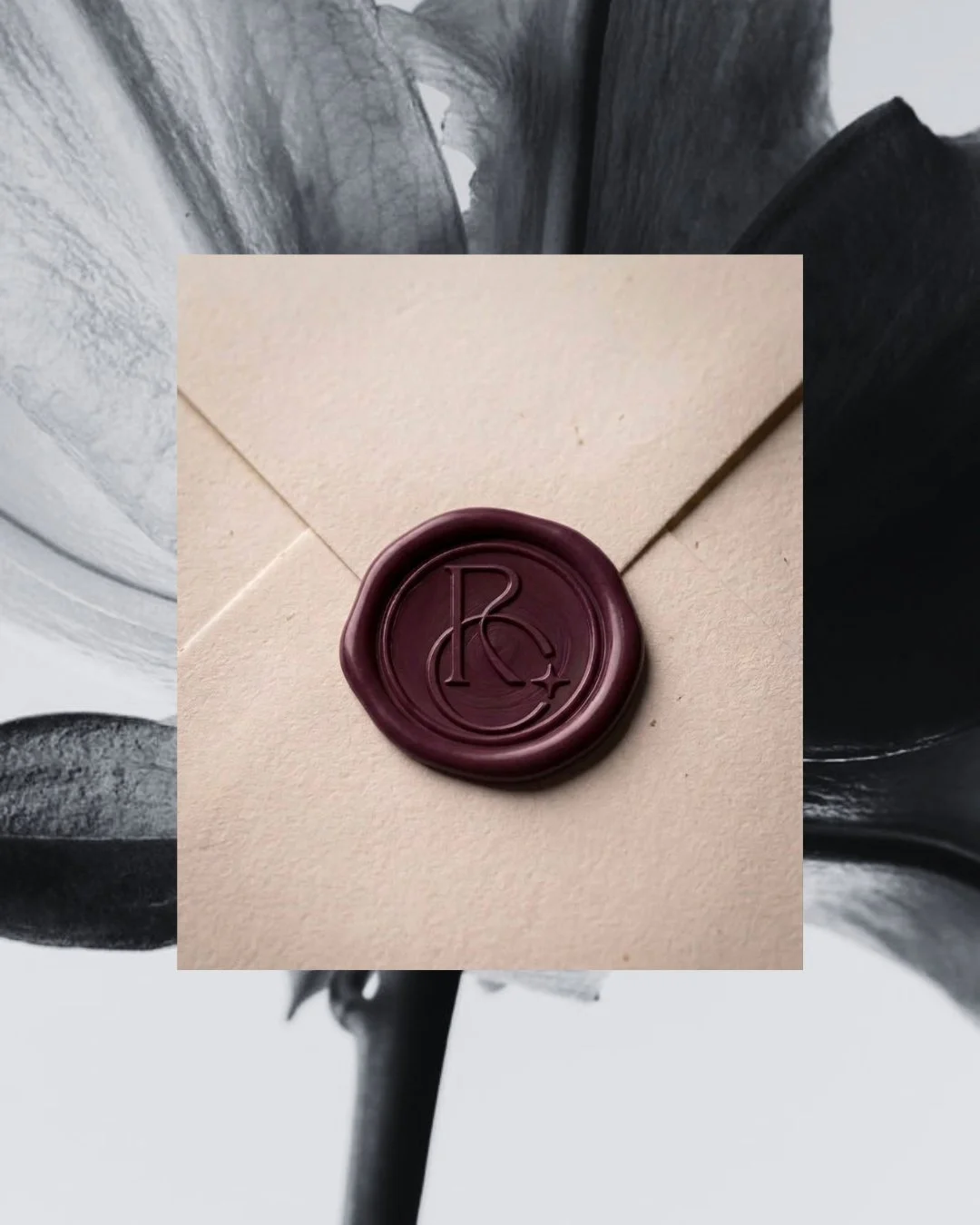
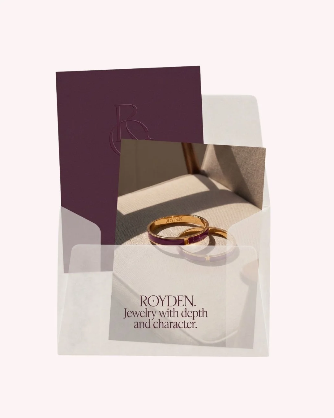
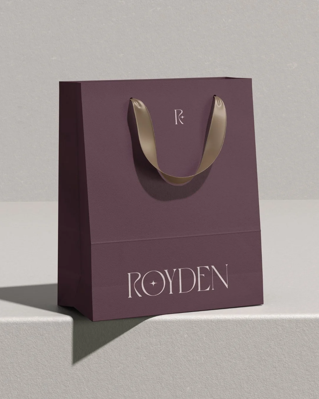
For the physical experience, we conceptualized a comprehensive brand identity that brings this cosmic vision down to a personal level. We developed cohesive touchpoints that customers can touch and feel, including debossed business cards, custom deep-burgundy wax seals, and sophisticated velvet-lined jewelry boxes paired with elegant shopping bags. Every asset was carefully selected to celebrate the brand's rich, organic color palette.
The outcome is a cohesive and memorable luxury identity that seamlessly connects concept, product, and tangible experience.